The 4 blog posts below this one haven't been marked/looked at yet:
1. Music videos over the decades
2. Visual Identity Components
3. Music Video
4. Visual Identity and portfolio website Links
I'm just letting you know so you don't dock marks for missing blog posts.
Thursday 28 January 2016
Monday 25 January 2016
Music Videos Over the Decades
1. Summarizing your thoughts, opinions and inspiration from the 9 videos you watched.
Michael Jackson - Thriller
I liked thriller a lot because aside from music videos with good stories, I like videos with great choreographed dances. The video has a bit of both, and has a unique theme to it that matches the song.
a-Ha - Take On Me
I enjoyed Take On Me for its special effects. Considering the stage that special effects were at in the '80s, this video was exceptional. It would have been interesting enough for the video to use the sketch effect the entire time, but to have it seamlessly switch between live-action and the special effects was what made it superb.
Peter Gabriel - Sledgehammer
One technique I like a lot is stop motion because a lot of cool things can be done with it. This music video proved all the possibilities of working with stop motion, such as when Peter Gabriel was pretending to be on a roller coaster as the chalkboard behind him changed angles, and his hair "blew in the wind" using hair gel. What makes stop motion unique from video is that still objects can be brought to life by moving them in between each picture being taken.
The Beastie Boys - Sabotage
I don't like the Beastie Boys that much, but I think the song went well with the video, even though this type of music didn't exist in the '70s yet. The video was very loose and gritty, and also played out all of the classic scenes you would see in old cop movies, which was satisfying in a way.
The Chemical Brothers - Let Forever Be
This music video was pretty trippy, and I love cool special effects. I could tell while watching it how much coordination and planning it took to make it seamless and natural.
Jungle - Julia
This video was not in the list, but I brought it up because it is too good to ignore. I am usually not patient when I watch music videos, and just skip ahead to get to the point, but this one I was engaged right from the beginning. I mentioned earlier that I like videos with great dance routines, and this one I felt really intertwined itself with the music. The dancing is very tight, and I liked the dramatic lighting and fighting style of dancing a lot.
OK Go - End Love
I like the music video for Here it Goes Again, but OK Go has a lot of great music videos. I chose End Love instead because while the treadmill routine is amusing, the band executed the stop motion technique in a way that exploited its full potential.
Jamiroquai - Virtual Insanity
I had my doubts when the video first started, and expected it to be another boring dance video, but I ended up liking this one a lot. The dancing was smooth and tight, and the moving walls/floor added an exciting touch as the dancer moved around the moving furniture.
Foster the People - Houdini
This probably my favourite music video of all time, which is why I was disappointed to see it wasn't in the lists of top 30 music videos. I really liked the story in the video, and the special effects and cinematography overall were crisp and to-the-point.
2. Which ones do you consider works of art in their own right? and Why? Note: The first video - Talking Heads "Once in a Lifetime" was exhibited in New York's Museum of Modern Art.
The most artistic video in my opinion is Julia by Jungle. While all of the other videos are intriguing, amusing, and mind-blowing, this one was the most expressive. The silent dancing to the music generated an energy and mood that I rarely feel when watching a music video, because unlike videos where people dance to either show off their bodies or dance moves, this one focused on the dance rather than the dancers.
3. Also, comment on the types of changes you noticed through the decades. (Lighting, editing, sophistication, pace etc.)
I noticed some obvious technical changes in music videos over the decades. Firstly, the quality of the resolution has increased as camera technology improved. The special effects have also gotten better. For example, the video for Once in a Lifetime has primitive effects compared to what exists today. Even several years later, an improvement is already seen in Take On Me with the sketch effect mixed with live-action. If you compare the green screen effect used in Once in a Lifetime to Houdini, the improvement is obvious. Another change I noticed that wasn't demonstrated in the lists of music videos I saw was the length and pacing. When music videos came out they more often than not jumped into the song without much introduction, and ended with the song. I noticed that is becoming popular in music videos to focus on the story a lot, and have long introductions and conclusions. I don't think modern music videos have more, better stories to them than old ones, but they certainly focus on the story more than the music, while it was the other way back then. For example, Kanye West made a 30 minute music video called "Runaway" with multiple songs in the short film. Another common thing done in modern music videos is to have sound effects throughout the video, and even parts where the music stops in the middle for dialogue to happen. Not even 20 years ago, the audio in a music video was simply the song without pauses or extra sounds put in.
4. How does the Arcade Fire video compare to the earlier decades?
Considering the fact that the internet didn't even exist when music videos first came out, the Arcade Fire video is rocket science in comparison. Green screens were the latest technology at one point, and would have put people in awe the same way it did when "We Used to Wait" came out. This video is complex, the way it takes the information you give it (location on Google Earth) and incorporates it into the video, and opens and closes windows automatically as the song plays, followed by the part when you type in a message to your past self. Although this will be normal in the future, I find it intriguing how as the person turns around in circles, the street view turns as well, or how it shows the person running on the ground in the aerial view of the neighbourhood you grew up in. If music videos continue to take this course, I will want to watch them all the time.
5. What's next in music videos in your opinion?
Music videos have come a long way, but I think they still have room for improvement. However, I don't think the improvement should be in the technology, but the creators of the videos. I feel that a lot of music videos, especially ones today, don't have much direction. Many music videos now are basically singers doing promiscuous dancing/singing in different locations wearing different outfits, and the video is made up of cuts to those different shots. Even when there is a story, it's usually pretty basic, and even then still has those slow motion shots to show off how attractive the performers are. The one commodity that all of the videos I listed have is they all have direction. Even if there isn't a story being directly told, there is a clear rising action, climax, and falling action. All of these videos have interesting imagery as well, whether it was the dance moves, special effects, or simply the overall look of the shoot (colour balance, pace, acting).
In the future I hope artists take advantage of what can be done with technology, or get creative with the stories in the videos. Either way, I think all music videos should be engaging right from the start, and have a clear direction.
1. Comment on the pacing, artistic style, lighting and artistic intent/meaning.
I think this video hit all the points technically and artistically. There was a lot of camera movement that helped make shots dynamic, including truck, pan, tilt, and zoom. If the shots were taken in a static position (no camera movement) it would have made the video look more like a home video than a professional production. I also liked the colouration of the sets and filter on the camera: for example, the red and gold in the background at 0:28, or the platinum white instruments and outfits with the saturated blue stage lights at 2:43. The special effects were also very satisfying to the eye. I liked how at 1:49 the shot starts with all the people in the green screen suits holding the performers, and then when the video starts they disappear, and it looks like the band is alive and playing their instruments. Another touch I liked was the slow motion to realtime transition that happens throughout the video, such as at 1:56. As for the story, I thought it was unique and well-developed, with the problem in the beginning, and how everything came together in the end, finishing the video with a shot of the crew partying around the dead band members.
2. How does this video visually express the emotional theme of the music?
The video goes well with the music. Despite the dark humour, it is a positive, energetic video that matches the mood of the music. I am not sure if this is a coincidence, but I like how the song is called Houdini, and at 1:50 the green screen people disappear just as the lead singer says "sometimes I wanna disappear." The video uses lots of popping colours and cool special effects that I think match the colour of the song, so to speak. The song is tight with an electric touch, and the visuals match it well.
Michael Jackson - Thriller
I liked thriller a lot because aside from music videos with good stories, I like videos with great choreographed dances. The video has a bit of both, and has a unique theme to it that matches the song.
a-Ha - Take On Me
I enjoyed Take On Me for its special effects. Considering the stage that special effects were at in the '80s, this video was exceptional. It would have been interesting enough for the video to use the sketch effect the entire time, but to have it seamlessly switch between live-action and the special effects was what made it superb.
Peter Gabriel - Sledgehammer
One technique I like a lot is stop motion because a lot of cool things can be done with it. This music video proved all the possibilities of working with stop motion, such as when Peter Gabriel was pretending to be on a roller coaster as the chalkboard behind him changed angles, and his hair "blew in the wind" using hair gel. What makes stop motion unique from video is that still objects can be brought to life by moving them in between each picture being taken.
The Beastie Boys - Sabotage
I don't like the Beastie Boys that much, but I think the song went well with the video, even though this type of music didn't exist in the '70s yet. The video was very loose and gritty, and also played out all of the classic scenes you would see in old cop movies, which was satisfying in a way.
The Chemical Brothers - Let Forever Be
This music video was pretty trippy, and I love cool special effects. I could tell while watching it how much coordination and planning it took to make it seamless and natural.
Jungle - Julia
This video was not in the list, but I brought it up because it is too good to ignore. I am usually not patient when I watch music videos, and just skip ahead to get to the point, but this one I was engaged right from the beginning. I mentioned earlier that I like videos with great dance routines, and this one I felt really intertwined itself with the music. The dancing is very tight, and I liked the dramatic lighting and fighting style of dancing a lot.
OK Go - End Love
I like the music video for Here it Goes Again, but OK Go has a lot of great music videos. I chose End Love instead because while the treadmill routine is amusing, the band executed the stop motion technique in a way that exploited its full potential.
Jamiroquai - Virtual Insanity
I had my doubts when the video first started, and expected it to be another boring dance video, but I ended up liking this one a lot. The dancing was smooth and tight, and the moving walls/floor added an exciting touch as the dancer moved around the moving furniture.
Foster the People - Houdini
This probably my favourite music video of all time, which is why I was disappointed to see it wasn't in the lists of top 30 music videos. I really liked the story in the video, and the special effects and cinematography overall were crisp and to-the-point.
2. Which ones do you consider works of art in their own right? and Why? Note: The first video - Talking Heads "Once in a Lifetime" was exhibited in New York's Museum of Modern Art.
The most artistic video in my opinion is Julia by Jungle. While all of the other videos are intriguing, amusing, and mind-blowing, this one was the most expressive. The silent dancing to the music generated an energy and mood that I rarely feel when watching a music video, because unlike videos where people dance to either show off their bodies or dance moves, this one focused on the dance rather than the dancers.
3. Also, comment on the types of changes you noticed through the decades. (Lighting, editing, sophistication, pace etc.)
I noticed some obvious technical changes in music videos over the decades. Firstly, the quality of the resolution has increased as camera technology improved. The special effects have also gotten better. For example, the video for Once in a Lifetime has primitive effects compared to what exists today. Even several years later, an improvement is already seen in Take On Me with the sketch effect mixed with live-action. If you compare the green screen effect used in Once in a Lifetime to Houdini, the improvement is obvious. Another change I noticed that wasn't demonstrated in the lists of music videos I saw was the length and pacing. When music videos came out they more often than not jumped into the song without much introduction, and ended with the song. I noticed that is becoming popular in music videos to focus on the story a lot, and have long introductions and conclusions. I don't think modern music videos have more, better stories to them than old ones, but they certainly focus on the story more than the music, while it was the other way back then. For example, Kanye West made a 30 minute music video called "Runaway" with multiple songs in the short film. Another common thing done in modern music videos is to have sound effects throughout the video, and even parts where the music stops in the middle for dialogue to happen. Not even 20 years ago, the audio in a music video was simply the song without pauses or extra sounds put in.
4. How does the Arcade Fire video compare to the earlier decades?
Considering the fact that the internet didn't even exist when music videos first came out, the Arcade Fire video is rocket science in comparison. Green screens were the latest technology at one point, and would have put people in awe the same way it did when "We Used to Wait" came out. This video is complex, the way it takes the information you give it (location on Google Earth) and incorporates it into the video, and opens and closes windows automatically as the song plays, followed by the part when you type in a message to your past self. Although this will be normal in the future, I find it intriguing how as the person turns around in circles, the street view turns as well, or how it shows the person running on the ground in the aerial view of the neighbourhood you grew up in. If music videos continue to take this course, I will want to watch them all the time.
5. What's next in music videos in your opinion?
Music videos have come a long way, but I think they still have room for improvement. However, I don't think the improvement should be in the technology, but the creators of the videos. I feel that a lot of music videos, especially ones today, don't have much direction. Many music videos now are basically singers doing promiscuous dancing/singing in different locations wearing different outfits, and the video is made up of cuts to those different shots. Even when there is a story, it's usually pretty basic, and even then still has those slow motion shots to show off how attractive the performers are. The one commodity that all of the videos I listed have is they all have direction. Even if there isn't a story being directly told, there is a clear rising action, climax, and falling action. All of these videos have interesting imagery as well, whether it was the dance moves, special effects, or simply the overall look of the shoot (colour balance, pace, acting).
In the future I hope artists take advantage of what can be done with technology, or get creative with the stories in the videos. Either way, I think all music videos should be engaging right from the start, and have a clear direction.
1. Comment on the pacing, artistic style, lighting and artistic intent/meaning.
I think this video hit all the points technically and artistically. There was a lot of camera movement that helped make shots dynamic, including truck, pan, tilt, and zoom. If the shots were taken in a static position (no camera movement) it would have made the video look more like a home video than a professional production. I also liked the colouration of the sets and filter on the camera: for example, the red and gold in the background at 0:28, or the platinum white instruments and outfits with the saturated blue stage lights at 2:43. The special effects were also very satisfying to the eye. I liked how at 1:49 the shot starts with all the people in the green screen suits holding the performers, and then when the video starts they disappear, and it looks like the band is alive and playing their instruments. Another touch I liked was the slow motion to realtime transition that happens throughout the video, such as at 1:56. As for the story, I thought it was unique and well-developed, with the problem in the beginning, and how everything came together in the end, finishing the video with a shot of the crew partying around the dead band members.
The video goes well with the music. Despite the dark humour, it is a positive, energetic video that matches the mood of the music. I am not sure if this is a coincidence, but I like how the song is called Houdini, and at 1:50 the green screen people disappear just as the lead singer says "sometimes I wanna disappear." The video uses lots of popping colours and cool special effects that I think match the colour of the song, so to speak. The song is tight with an electric touch, and the visuals match it well.
Visual Identity: Finished Components
 |
| Business Card |
 |
| Envelope |
 |
| Flyer |
| Logo |
 |
| Custom USB with free sample library |
Sunday 24 January 2016
Friday 27 November 2015
Visual Identity: Initial Musings
Through propaganda and merchandise that I will design myself, I will advertise myself as a musician. I am promoting myself as a musician instead of a visual artist because the resulting products (logo, business card, website, etc.) will not only be applicable to the class assignment, but they will also help me when I enter the music industry with an already existing collection of promotional material.
One advantage I have over other musicians is that I have experience in art and design, which will help in more ways than one. People always say that we should never judge a book by its cover, but everyone actually does in reality. This is because in the time we are living in now, with the prominence of technology and media in our lives, we are exposed to countless advertisements, popups, articles, text messages, emails, notifications, and many other forms of communication that are trying to catch our attention. With that in mind, it is important that I stand apart from the other musicians if I want to be noticed, which can be done by using visually interesting propaganda.
I am not certain what specific aspect(s) of myself I will advertise yet, which could include pedagogy, performance, sound production, and composition and arranging. I am still debating whether I want to focus on one of my areas of expertise, some of them, or all of them, which I may decide depending on which one I feel I am most skilled in.
I intend to communicate sharpness, boldness, and a sense of dependability, while also giving off the impression that I am friendly, open, and honest, which are all important characteristics of a musician looking for a job. Certain artistic elements will come into play when I design my promotional material. I want to use a clean, thin font without too many embellishments, which will convey precision and simplicity. Below is a sample from the business card I started designing, which gives a basic idea of what I want. Everything may change completely over time, but the idea of simplicity and conciseness will remain the same.

Saturday 7 November 2015
Photography Class: Product Advertisement Shoot

I am proud to say that the advertisement above was 100% shot and designed by me. In photography class, my teacher presented the grade 12s with the task of having to pick a product of their choice and shooting professional pictures of it using the photography studio. Prior to the assignment, he showed us lighting techniques and how to operate photography equipment (soft boxes, cameras, remote adapters, etc.) to help make our photos turn out looking professional.
The criteria for the assignment were simple and nonrestrictive, allowing everyone freedom in their ad design: there had to be a shot of the product by itself, and a shot of a model interacting with the product, which in my case was a singer. I looked at existing microphone advertisements for the Yeti as well as others, and established in my head an idea of how a good microphone advertisement should look.
In my advertisement, there are certain factors which I made sure to include to make it clean and complete. The first step I took was editing the raw photos. While the pictures I took were good as they were, I gently increased the contrast to get that sleek, metallic shine that is best visible to the naked eye. For the model shot, I increased the contrast on the entire photo, but added vibrancy and brightness to only the microphone, and "feathered" the layer so it bled into its surroundings, making it appear as if the microphone is radiating brilliance. As a small touch, I slightly increased the brightness and contrast of the Blue logo on the microphone to make it stand out more.
The next step was the layout. Since the model shot is the most dynamic and interesting, I made it the main photo to draw in the viewer. To accompany that, I placed the headline headline text next to the microphone. I used a geometric and bold font to convey sleekness and modernity, to show that the microphone is the latest and greatest installment in its market. The choice of colour was carefully picked. For the word "Blue," I used a vibrant, deep blue to mimic the logo, and turquoise for "yeti" because that is the colour that the company uses in their advertisements and packaging for this product. I then used white to create a balance in the weight of the colours for the rest of the text.
The next step was laying out the microphone shots in the bottom right corner. These are the "informational" shots, giving the consumer a full, plain view to give them a good idea of exactly what they are looking at. I made sure the microphone was angled straight up in both shots as well as make them the same size to keep consistency, making them easier to compare.
Every good advertisement will have the logo clearly printed somewhere to inform consumers of who made the product they are looking at, that way they know who to go to when they are interested in purchasing the item on display. I kept it simple by taking Blue's logo and putting it in the bottom right corner.
The final step was the brief blurb on the Yeti, the most informational and hopefully most influential part of the advertisement. I decided to stay true to the company and use the original description of the microphone instead of my own, partly because it is more legitimate, and also because they wrote it well enough that there was no need to come up with something else. I used a simple and clean font for the summary because at that point, the viewer has been dazzled by the glowing shots of the microphone and edgy headline, and the focus should now be solely on the specifications. Although font types seem like a small part of the big picture, when a company is trying to catch and maintain people's interest, every nuance counts. When choosing the font for the blurb, I kept it simple because I personally think that the more elaborate and exciting fonts should be used for titles and headlines to grab attention, while more simple fonts are used for informational text.
I had my doubts in the beginning, but I'm pleased with how everything turned out, and wouldn't change a thing.
Wednesday 4 November 2015
Movie Trailer Recuts
A popular trend on the internet is creating movie trailer "recuts," which is essentially taking a trailer and completely changing the mood of the movie. For example, I watched the trailer for the movie "Top Gun," which is a typical macho, glamorized depiction of jet fighting featuring Tom Cruise. Immediately after, I watched a recut of the trailer, which turned the movie into a gay romance between Tom Cruise and a fellow soldier, whom he was originally enemies with. That is just one example; psychological thrillers have been turned into family feel-good movies, comedies into thrillers, and historical drama into romantic comedy. The basic idea remains the same, that the mood of a movie is completely changed using the same clips, but a different approach.
My recut is of the movie "Groundhog Day," originally a comedy, now converted into a psychological thriller. Watch the recut first, and then the original to see what I mean by a dramatic difference.
Recut
Original
As you may have noticed, I used many of the same clips from the original trailer in my recut. Obviously though, there is a dramatic difference in mood. To accomplish this, I watched many thriller movie trailers beforehand, and compiled a mental list of common cinematic techniques used to make them creepy and suspenseful.
Some technical aspects I included were the credits and the company logos, as seen in every trailer. I started the trailer with the standard green rating window that informs viewers of the content of the movie. I also used the Columbia logo screen in the beginning because that was the company who produced the movie. Before that though, I showed a brief shot of the clock striking 6 am, which was foreshadowing to what would become a motif throughout the video. The clock is supposed to be a symbol of the same day happening again endlessly, and the impending insanity on the main character. Another subtle technique I used was a cool-coloured filter on the video to add to the eerie feeling, because the original clips had warm, soft lighting often found in movies from the 80s and early 90s.
The text was another key part in passing on the mood. I originally used bold, red text, but I felt that was too cliché, and used in almost every thriller/horror trailer. By I accident, I discovered an interesting technique by which I made the text black, and added a soft white glow to outline the text, making it three-dimensional. Another cinematic trick I see often is the use of moving text, specifically when the text appears to move closer to the viewer. To make it smoother and more ominous, I made the text slowly fade as it got larger.
The difference in pacing was also an important change. If compared to the original trailer, the original has the same pacing throughout; the music is the same volume and tempo, and maintains a humorous, upbeat mood. The same goes for the video as well, with the trailer immediately beginning at a fast pace to the end. My recut is very different, with its much more dynamic pacing. Instead of "playing my cards" right from the start, I began by establishing the setting and characters. I used full clips with dialogue, and in one shot used slow-motion for a dramatic effect. At the part when the two men on the radio exclaim "it's Groundhog Day!" the pace begins to pick up, marked by the change in tempo of the music. At this part, the conflict is introduced, and the main character (Phil) is seen trying to grasp what is happening to him. The rise in excitement drops again, with the music coming to a sudden stop except for a deep bass note being held. This is the part when the tension begins to build, as Phil becomes desperate to escape the never-ending loop he has become stuck in. The sound effects and music die off to Phil's colleague saying "you're not a god," which is preceded by a start in the music again. The last two text blurbs before the credits are what entice the viewer, as if to say "watch as this guy goes slowly insane each day." Between each blurb, before the rest of the video, is Phil waking up with a distraught look on his face, the beginning of his imminent insanity. After the last title, the buildup begins with Phil giving his weather prediction, saying that the winter would be "cold, grey, and last the rest of your life," which viewers know he is actually referring to being stuck living the same day every day. This voiceover happens as shots of him slowly going crazy begin to go by faster and faster. The clips become shorter and flash by quickly, with the images and scenes increasing in intensity. To add to it, red flash filters I synced with Phil smashing the clock or driving toward the train were added to really set the mood. A common factor in story lines is to have a falling action after the climax to end with a sense of closure for the viewers. In this case, I ended right at the climax to leave people in suspense and craving the satisfaction of knowing how the story will end. This was important because the whole point of a trailer is to draw people in so they want to go see the movie.
Last but not least, the sound played a large role in establishing and supporting the mood throughout the video. I wrote the soundtrack myself, one reason being that I knew it would be difficult to find a track online to fit my recut, let alone one that was royalty free. The other reason was because I want to make a career writing music for movies, and this was the perfect opportunity to practice.
To start the trailer, I had a quiet synthesizer playing with a slightly out of tune mallet instrument to immediately tell viewers that this was going to be a dark movie. In accordance with the video, the music began at a slow tempo and low dynamics. As the shots progressed, I layered on more instruments and chords. To support the impact of the titles that appeared, I synchronized the sound of gongs, scrapes, and deep drums for when text popped up. When the clock strikes, and Phil wakes up, the music stops, and all that is left is the subtle sound of a low thud in the rhythm of a heartbeat. I then left out all music in the last few seconds before the pace change, because long pauses are used in music to create a dramatic and suspenseful effect. After the men on the radio say "Groundhog Day!" the music suddenly starts again, this time at a faster tempo, which tells the viewers that the story is beginning to intensify. The music proceeds to layer on more instruments and chords again, playing solemn, introspective music. It is once again cut off by a startling scraping sound, which is followed by complete silence except for a deep, sustained note in the bass line. At this point, Phil is telling his colleague about his experiences, and I used subtle effects, such as a low moan similar to wind blowing, a thud when Phil gets hit by the truck, and the car crashing as it hits the valley floor, with the sound of flames burning getting increasingly louder until it unexpectedly stops and cuts to Phil. In this brief moment of silence, Phil claims to be an immortal, followed by Rita telling him he's "not a god." This is followed by a low thud and gong, with the sound of clocks ticking in a cluttered manner. This is the last part of the trailer, when it is about to reach its climax. I started with a single low note on the synthesizer, and began layering on more, increasing the pitch. A common technique used in music and soundtracks is to steadily increase the pitch of notes or raise the octave to generate stress. To add to the stress, I slowly increase the amount of reverb on the mix to create a long, confusing echo to make Phil's last words resonate more with the audience. I also added a static sound which increased in volume until it cut off with the change to the title text, leaving viewers feeling like they were about to see the climax, but it was stopped right before they could see it. I left the credits in complete silence so as not to give the viewers any more of the trailer, and also because going from loud, intense music to complete silence has a powerful effect.
I'm happy with the trailer I did, and even after some of the rough patches I went through, I enjoyed the project.
Wednesday 21 October 2015
German Expressionism Vs. Projection Art
German Expressionism


Triggered by sound and movement.
Capable of tracking moving objects.
Traditional Projection Art

Conclusion:


"If you don't behave, Nolde will come and get you, and smear you all over his canvas."
~Scornful mother- Definition
- Stylistic Qualities
- Time Period + Significant Events
- Why this style began + Initial Artists
 |
|
Kirchner, "Berlin Street Scene," 1913
|
 |
|
Kollwitz, "Infant Mortality," 1925
|
 |
|
Kandinsky, “Improvisation 31,” 1913
|
"Degenerate Art"


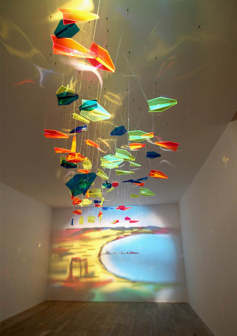
Projection Art
- Definition
- Stylistic Qualities
- Time Period + Significant Events
- Why this style began + Initial Artists
 |
| Urbanscreen. "555 KubiK" |

Start: 018
Triggered by sound and movement.
Capable of tracking moving objects.
Traditional Projection Art
.
.
.
.
.
.
.
.
.
.
.
.
.
.
.
.
.
.
.
.
.
.
.
.
.
.
Conclusion:
Paint is for old people.

Winner: Projection Art

Subscribe to:
Posts (Atom)